Adv Data Science using R Quiz and Assignment 2
These are Advance Data Science Using R Assignment 2 Solution
Quiz
Q1. It helps to find a numerical value expressing the relationship between variables
Regression
Correlation
Random Variable
Z-Value
Answer: Correlation
Q2. It is used to estimate values of random variable on the basis of the values of fixed variable.
Regression
Correlation
Random Variable
Z-Value
Answer: Regression
Q3. It attempts to model the relationship between two variables by fitting a linear equation to observed data.
Linear Regression
Covariance
Dependent Variable
S.D
Answer: Linear Regression
These are Advance Data Science Using R Assignment 2 Solution
Q4. __________ prints out the function call stack after an error occurs.
trace()
traceback()
back()
traback()
Answer: traceback()
Q5. Linear regression uses_______ for graphical representation in determining the strength of the relationship between two variables.
Histogram
Pie chart
Scatter diagram
Anova
Answer: Scatter diagram
Q6. Which of the following is primary tool for debugging?
debug()
trace()
browser()
traceback()
Answer: debug()
These are Advance Data Science Using R Assignment 2 Solution
Q7. Point out the wrong statement?
The primary task of debugging any R code is correctly diagnosing what the problem is
R provides only two tools to help you with debugging your code
print statement can be used for debugging purpose
The traceback() function must be called immediately after an error occurs
Answer: R provides only two tools to help you with debugging your code
Q8. Which function will be used melt.mind2<-_______(mind, id=c(“ID”,”BTW”)) melt.mind2
Cast
Melt
melt
cast
Answer: melt
Q9. Which function combines vectors as columns?
rbind()
cbind()
merge()
none of the above
Answer: cbind()
These are Advance Data Science Using R Assignment 2 Solution
Q10. The slope of the regression line of Y on X is also referred to as the:
Regression coefficient of X on Y
The correlation coefficient of X on Y
Regression coefficient of Y on X
Correlation coefficient of Y on X.
Answer: Regression coefficient of Y on X
Q11. Which of the assertions below is the least accurate?
When outliers are present in the data series, correlation is a more reliable or relevant measure.
Two variables having a significant nonlinear relation can still have a relatively low correlation.
Correlation among two variables can emerge from their relationship with a third variable rather than a direct relationship between them.
None of the preceding.
Answer: When outliers are present in the data series, correlation is a more reliable or relevant measure.
Q12. The correlation coefficient is?
The square of the coefficient of determination
Can never be negative
The square root of the coefficient of determination.
The same as r square
Answer: The square root of the coefficient of determination.
These are Advance Data Science Using R Assignment 2 Solution
Q13. The correlation for the values of two variables moving in the same direction is
Perfect positive
Negative
Positive
No correlation.
Answer: Positive
Q14. Who introduced the term ‘regression’?
Karl Pearson
R.A Fischer
Croxton and Cowden
Francis Galton.
Answer: Francis Galton.
Q15. The correlation coefficient describes
Only magnitude
Both magnitude and direction
Only direction
None of the preceding options.
Answer: Both magnitude and direction
These are Advance Data Science Using R Assignment 2 Solution
Assignment
Q1) Do the data visualization by using regression in R.
Solution:
Please update your NAME and UID in every code and then paste ss.
Step 1: Download both sample datasets
Start by downloading R and RStudio. Then open RStudio and click on File > New File > R Script.
To install the packages you need for the analysis, run this code (you only need to do this once):
install.packages("ggplot2")
install.packages("dplyr")
install.packages("broom")
install.packages("ggpubr")
Next, load the packages into your R environment by running this code (you need to do this every time you restart R):
library(ggplot2)
library(dplyr)
library(broom)
library(ggpubr)
Step 2: Load the data into R
Follow these four steps for each dataset:
- Extract the Downloaded Zip of sample datasets.
- In RStudio, go to File > Import dataset > From Text (base).
- Choose the data file you have downloaded (income.csv or heart.csv), and an Import Dataset window pops up.
- In the Data Frame window, you should see an X (index) column and columns listing the data for each of the variables (income and happiness or biking, smoking, and heart.disease).
- Click on the Import button and the file should appear in your Environment tab on the upper right side of the RStudio screen.
After you’ve loaded the data, check that it has been read in correctly using summary().
Step 3: Perform the linear regression analysis
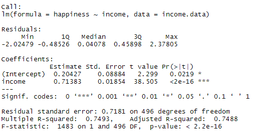
Simple regression: income and happiness
income.happiness.lm <- lm(happiness ~ income, data = income.data)

summary(income.happiness.lm)
print("Name: PROGIES ,UID:")
The output looks like this:
Multiple regression: biking, smoking, and heart disease
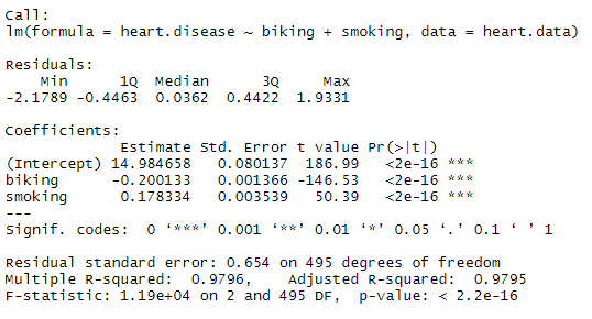
heart.disease.lm<-lm(heart.disease ~ biking + smoking, data = heart.data)

summary(heart.disease.lm)
print("Name: PROGIES ,UID:")
The output looks like this:
Step 4: Check for homoscedasticity
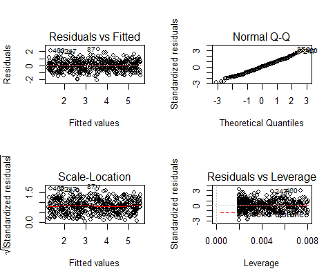
Simple regression
par(mfrow=c(2,2))
plot(income.happiness.lm)
par(mfrow=c(1,1))print("Name: PROGIES ,UID:")
These are the residual plots produced by the code:
Multiple regression
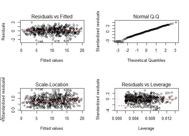
par(mfrow=c(2,2))
plot(heart.disease.lm)
par(mfrow=c(1,1))print("Name: PROGIES ,UID:")
The output looks like this:
Step 5: Visualize the results with a graph
Simple regression
Follow 4 steps to visualize the results of your simple linear regression.
- Plot the data points on a graph
income.graph<-ggplot(income.data, aes(x=income, y=happiness))+
                     geom_point()
income.graph
print("Name: PROGIES ,UID:")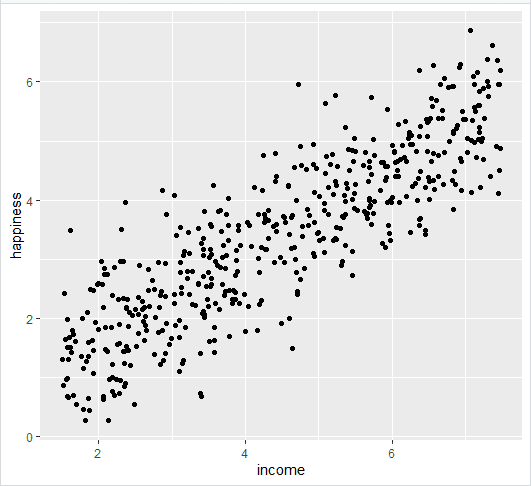
- Add the linear regression line to the plotted data
income.graph <- income.graph + geom_smooth(method="lm", col="black")

income.graph
print("Name: PROGIES ,UID:")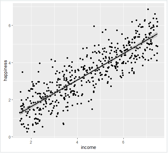
- Add the equation for the regression line.
income.graph <- income.graph +
  stat_regline_equation(label.x = 3, label.y = 7)

income.graph
print("Name: PROGIES ,UID:")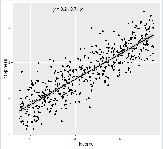
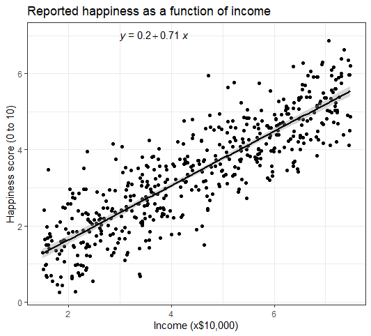
- Make the graph ready for publication
income.graph +
  theme_bw() +
  labs(title = "Reported happiness as a function of income",
      x = "Income (x$10,000)",
      y = "Happiness score (0 to 10)")
print("Name: PROGIES ,UID:")
This produces the finished graph that you can include in your papers:
Multiple regression
There are 7 steps to follow.
- Create a new dataframe with the information needed to plot the model
plotting.data<-expand.grid(
  biking = seq(min(heart.data$biking), max(heart.data$biking), length.out=30),
    smoking=c(min(heart.data$smoking), mean(heart.data$smoking), max(heart.data$smoking)))
print("Name: PROGIES ,UID:")- Predict the values of heart disease based on your linear model
plotting.data$predicted.y <- predict.lm(heart.disease.lm, newdata=plotting.data)
print("Name: PROGIES ,UID:")- Round the smoking numbers to two decimals
plotting.data$smoking <- round(plotting.data$smoking, digits = 2)
print("Name: PROGIES ,UID:")- Change the ‘smoking’ variable into a factor
plotting.data$smoking <- as.factor(plotting.data$smoking)
print("Name: PROGIES ,UID:")- Plot the original data
heart.plot <- ggplot(heart.data, aes(x=biking, y=heart.disease)) +
  geom_point()

heart.plot
print("Name: PROGIES ,UID:")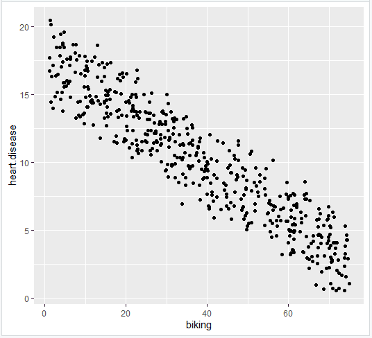
- Add the regression lines
heart.plot <- heart.plot +
  geom_line(data=plotting.data, aes(x=biking, y=predicted.y, color=smoking), size=1.25)

heart.plot
print("Name: PROGIES ,UID:")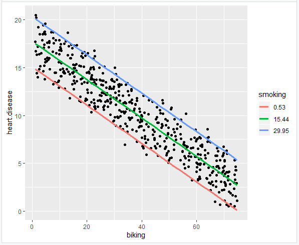
- Make the graph ready for publication
heart.plot <-
heart.plot +
  theme_bw() +
  labs(title = "Rates of heart disease (% of population) \n as a function of biking to work and smoking",
      x = "Biking to work (% of population)",
      y = "Heart disease (% of population)",
      color = "Smoking \n (% of population)")

heart.plot
print("Name: PROGIES ,UID:")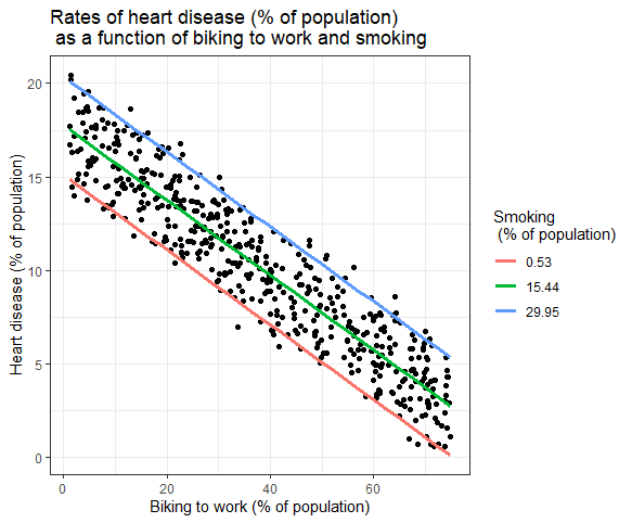
heart.plot + annotate(geom="text", x=30, y=1.75, label=" = 15 + (-0.2*biking) + (0.178*smoking)")
print("Name: PROGIES ,UID:")
This is the finished graph that you can include in your papers!
Step 6: Report your results
In addition to the graph, include a brief statement explaining the results of the regression model.Reporting the results of simple linear regressionWe found a significant relationship between income and happiness (p < 0.001, R2 = 0.73 ± 0.0193), with a 0.73-unit increase in reported happiness for every $10,000 increase in income.Reporting the results of multiple linear regressionIn our survey of 500 towns, we found significant relationships between the frequency of biking to work and the frequency of heart disease and the frequency of smoking and frequency of heart disease (p < 0 and p < 0.001, respectively).
Specifically we found a 0.2% decrease (± 0.0014) in the frequency of heart disease for every 1% increase in biking, and a 0.178% increase (± 0.0035) in the frequency of heart disease for every 1% increase in smoking.
Q2) Fill appropriate debugging function into the blank space.
- A more sophisticated debugging method is to put a call to browser() in your code. This will stop execution at that point and open R’s interactive debugger. In the debugger you can run any R command to look at objects in the current environment, modify them and continue executing.
- The traceback() function can be used to print a summary of how your program arrived at the error. This is also called a call stack. In R this gives you each call that lead up to the error, which can be very useful for determining what lead to the error.
- recover() is not used directly, instead it is used as an error handler, by calling options(error = recover). You can also use other functions, such as browser() as an error handler, which will start the debugger automatically when there is an error.
Q3) Write the code to reshape the following data first from wide to long and then long to wide. Write the name of the functions you will use.

Solution:
Wide to long:
import pandas as pd

# Create wide dataframe
df = pd.DataFrame({'id': [1, 1, 2, 2], 'time': [1, 2, 1, 2], '*1': [5, 3, 6, 2], '*2': [6, 5, 1, 4]})

# Use pd.melt() to reshape data
df_long = pd.melt(df, id_vars=['id', 'time'], value_vars=['*1', '*2'], var_name='variable', value_name='value')
Long to wide:
# Use pd.pivot_table() to reshape data
df_wide = df_long.pivot_table(index=['id', 'time'], columns='variable', values='value')

# Reset the index
df_wide.reset_index(inplace=True)
These are Advance Data Science Using R Assignment 2 Solution
Get more about R language here:
Advance Data Science using R all weeks assignments: Click Here
